


About Page Layouts
Pages on the MDC site adhere to a number of defined layouts. To see the layout for a specific page type, visit the guidelines and page links in the accordions below.
Title
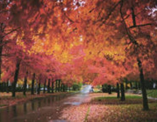
Home Page
Home Page Design Layouts
Title
Landing Pages
Landing pages are for the sections listed in the top navigation. Ideally they should include all the following elements for the greatest consistency.
Landing Page Components
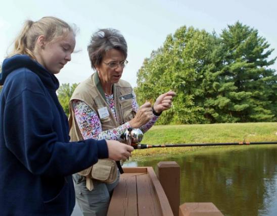
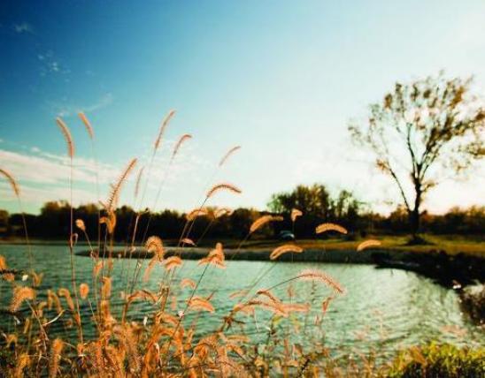
- Section hero - image, title of section, subtitle descriptive text
- Component header - FEATURED TOPICS
- Cards - with images and descriptive text, four in a row featuring seasonal highlights or popular pages
- Component header - IN THIS SECTION
- Link group - links to all topics in the section
Landing Page Design Layouts
Title
Guide Pages
There are three special "guide" pages designed for your site: Hunting Guide, Field Guide, and Fishing Guide. Each are similar to one another in general layout and are reminiscent, also, of Landing Pages. But they have special content on them to support user exploration into guide information.
Field Guide Layouts
Fishing Guide Layouts
Hunting Guide Layouts
Title
Permits and Seasons Pages
The Permits and Seasons sections have special layouts and content to support user exploration.
Permits Layouts
- Section landing page
- Fishing Permits search page
- Fishing Permits detail page
- Hunting Permits search page
- Hunting Permits detail page
Seasons Layouts
Title
Places to Go Pages
Places to Go is a section in Discover Nature with special content and layouts to support user exploration.
Places to Go Design Layouts
Title
Topic Pages
Topic pages are sections with an automatic "In this Section" left navigation.
Topic Landing Page Components
Elements on all topic landing pages
- Breadcrumb - generated automatically by page hierarchy
- Topic Title - generated automatically by topic title
- Page Title - generated automatically by page title for the page
- In this Section - left navigation generated automatically from topic pages
- Section Hero - image, title of section, subtitle descriptive text (image is confined to fit 2/3 page)
- Text - introduction to topic group, use H2-4 headings to break up text
Components that may be on a topic landing page
Content creator chooses elements based on content type and length.
- More text about the topic
- Component Header - IN THIS SECTION or FEATURED TOPICS
- Cards - with images and descriptive text about pages within this topic section
- Component Header - RELATED CONTENT or RESOURCES
- Link Group - links to pages, outside links, or PDFs related to the topic
- Call-to-Action, Promo, Stat, and Media components may be used to highlight information and create visual variety.
Topic Landing Page Examples
- Community Conservation
- Improve Your Property
- Wildlife Diseases
- Get Started Fishing
- Trophies and Certificates
Topic Interior Pages
Generally, with interior pages throughout the site whether in topics or not, it is up to the content creator to choose the appropriate reusable components that best accommodate the content. For instance, some content really requires a table layout, in which case a table should be entered using the text component. Aim to create pages that offer visual variety and interest, that chunk content up into smaller sections, and choose one or more components that are more visually oriented such as media elements and stats blocks to enhance drier text content. Finally, if you can, place text into sections that are not 100% to avoid strain on eye tracking.
Topic Interior Page Examples
Title
Interior Pages
All the reusable components available in your CMS can be used in various combinations with each other to fulfill the site's interior pages, according to the content you need to convey.
Generally with interior pages throughout the site, it is up to the content creator to select the reusable components that best showcase the content. Content creators should aim to create pages that offer variety and interest, that chunk content up into smaller sections (use the component header and /or header text styles), and aim for one or more components that are more visually oriented such as media elements and stats blocks to enhance drier text content. Finally, if you can, place text into sections that are not 100% to avoid strain on eye tracking.
Interior Page Elements
- Breadcrumb - generated automatically by page hierarchy
- Topic Title - generated automatically by topic title
- Page Title - generated automatically by page title for the page
- Media - image or video with caption
- Text - use H2-4 headings to break up text
- Component Header - to break up sections of your page as needed, and to group components
- Accordions - use with longer text to allow readers to quickly scan page contents
- Call to Action - for related info
- Stats Block - to display "at a glance" numeric info, data, and statistics
- Card - to link to another page
- Link Group - to provide several links or files in a consolidated display
Interior Page Examples
Many possibilities exist for how to display information on a page. While selecting which components to use can be a subjective decision, here are some guidelines to help maintain consistency among pages within the MDC website.
Title
Choosing component headers or H2/H3 headings
In general, the first heading on a page should always be H2 level. However, component headers may also be appropriate as the first heading, depending on page content. Longer pages can often benefit from component headers because they provide a visual break in the information. Sometimes both kinds of headings will be needed on the same page.
Choose heading types based on length of content and the look and feel of the page. While this is a subjective decision, there are certain times when component headers are preferred.
- Component headers are always used for “Featured Topics” and “In This Section” on landing pages.
- Component headers are almost always used for “Resources” and “Related Content.”
- Component headers are often work well above accordions, groups of cards, and link groups.
Examples of different heading types on MDC webpages:
H2/H3 headings
Priority Geographies. (topic landing page)
Component headers
Wildlife (main landing page)
Resources for Community Leaders and Developers
Both types of headings on same page
Title
Choosing cards or link groups for related content/resources
Many pages on the MDC website offer "Related Content" or "Resources" at the bottom of the page.
Related Content = links to pages (internal or external) or to PDFs with content that is related to the page topic but directly. They provide information for further exploration.
Resources = links to information that is directly applicable to the page topic.
These two categories can overlap and distinguishing between them can be ambiguous, so use your best judgment.
To display these items:
- Use a component header for both.
- Use link groups (99% of the time) to display the links.
- Use cards to display links when the page calls for a more robust look. This is a subjective decision. See examples below.
- Use one, two, or three columns to display the links, depending on the number of links and length of text.
- If more than one row, it may be best to start a new section for each row to keep the row spacing even when the description lengths vary.
Examples
Related Content
Squirrel Management (cards)
Resources
Managing Warm-Season Grass Pastures
Tree and Plant Disease and Pests (cards)
Title
Displaying reports and management plans
Reports and management plans are generally displayed as link groups or horizontal cards. Deciding which way to display them on the page depends on the number of reports and the overall look of the page.
Examples:
Horizontal cards (hunting reports)
Waterfowl Reports and Prospects
Link groups for PDFs (reports, management plans, guidelines, BMPs)
Turkey Reports for Past Seasons
Title
Displaying notices and call-outs for important information
Sometimes it is helpful to draw attention to critical information on a page (deadlines, important rules/regulations, or essential facts). This can be accomplished with a few different components:
- Call to action (CTA)
- Promo
- Stats
- Component header #4 and text below
How do you choose? This is a subjective decision and depends on the overall look and feel of a page. Review the pages below to see a variety of uses.
CTA
Promo
Paddlefish: Snagging Report and Advisories
Stats
Component Header #4 with accompanying text block below
Paddlefish: Snagging Report and Advisories