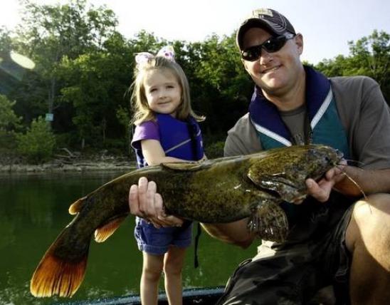
Lorem ipsum dolor sit amet, consectetur adipiscing elit, sed do eiusmod tempor incididunt ut labore et dolore magna.
Card Intent and Usage
Cards are used to provide links or navigation to other pages in a way that is more prominent than a simple text link. Using images along with supporting text creates a more informative and powerful call to action. Cards provide the opportunity to bring visual interest to a page and draw user activity.
Card Design Guidelines
- Cards automatically apply a dark brown overlay background for text as well as associate subtext and description either below or to the side of the card image.
- Content managers can choose to create vertical cards, in which the subtitle and descriptive text goes below the card/title, or horizontal cards, in which the subtitle and descriptive text displays to the right of the card/title.
- While these are image-oriented elements, the image is an optional field on cards and cards can still be a valuable, effective way to provide navigation without imagery used.
- When placing a group of cards, use images in all of the cards in that grouping or in none of them. Consistency within a group of cards keeps users from being distracted by "outliers" and avoids emphasis from accidentally being placed on one card over others because it looks different from the others.
- As a general rule, use either an image or an icon, but not both, to avoid making the cards "too busy." Exceptions to this rule may come up.
- On most pages, use a two-column (50/50) or three-column (33/33/33) layout for cards.
- Main landing pages can use a four-column layout for cards.
- Avoid using full-width cards (an individual card that spans the full width of a page).
Card Content Guidelines
- Title should be no more than two lines.
- Titles should use active voice and direct language.
- Subtitle should be no more than one line.
- Text should be no more than three lines.
- Text should state the purpose of the card or reference the user goal.
- Link text, if used at the bottom of the card, should call for specific, meaningful action. Do not write "Learn more" or "Get more info"; write "View the records" or "Read about tree pests."
- Link text at the bottom of cards is best used with smaller groups of cards, such as a single row of cards under Featured Topics headings on landing pages. Avoid using on pages that have more than two rows of cards.
Card Examples


Lorem ipsum dolor sit amet, consectetur adipiscing elit. Etiam pellentesque euismod ante, vel pellentesque orci malesuada sit amet. Donec ut egestas libero. Phasellus condimentum tellus quis euismod auctor.

Lorem ipsum dolor sit amet, consectetur adipiscing elit. Etiam pellentesque euismod ante, vel pellentesque orci malesuada sit amet.
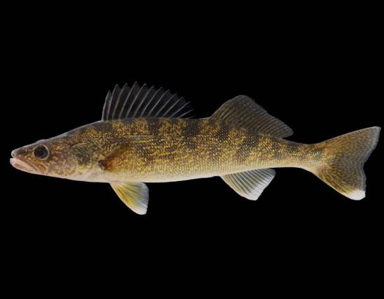
Lorem ipsum dolor sit amet, consectetur adipiscing elit, Other Link Here. Sed do eiusmod tempor incididunt ut labore et dolore magna.
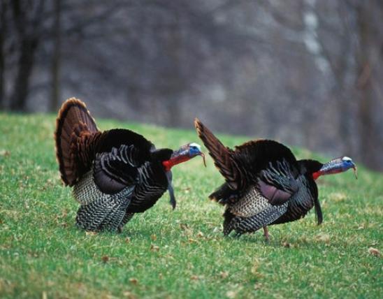
Turkeys are most famous for their gobbling calls, but they make many other vocalizations as well.
Find information about cards in this online summary report.

Lorem ipsum dolor sit amet, consectetur adipiscing elit, sed do eiusmod tempor incididunt ut labore et dolore magna.
The ailanthus webworm moth is long and thin and curves its wings lengthwise along the body. Forewings are orange with white spots outlined in black (these often look like tiny flower patterns).
Horizontal Card Examples
Browse Missouri's wetland-area conditions and teal-hunting opportunities.
Find information about species and natural communities of conservation concern, public lands, and sensitive reso
View Examples of Cards on the MDC Website
Use horizontal cards as the standard way to display reports on pages that provide a series of hunting or fishing reports as shown in the example pages above.
